Search This Blog

Sunday 19 June 2016

'The Voronov Plot' by Yves Sente and André Juillard


Blake and Mortimer’s resurrection is an interesting phenonomen. Edgar P Jacobs was at the forefront of the development of the cartoon in the forties and fifties, as he worked with Hergé, who pushed the boundaries of the new medium. 

Hergé’s last complete book was in the seventies and Jacobs died in the eighties. It was not for two decades that Blake and Mortimer were brought back to life, and those years had seen many changes in cartoon books, or graphic novels, as they had come to be known. The medium had matured, and artists were tackling much more ambitious subjects. The gag, that underpinned early comics, was now all but gone, and the flippant tone, aimed only at children was replaced with serious subject matter, such as the Holocaust, in Art Spiegelman’s Maus.

The evolution, started by Hergé, had continued throughout the sixties with Robert Crumb, through to the eighties, with Frank Miller’s The Dark Knight Returns, bringing even more complex themes, plots and characters.

The new Blake and Mortimer books reflect the new readership, of a generation brought up on these books. Characters have a past which sometimes catches up with them (The Oath of the Five Lords), old flames that they reconnect with (The Gondwana Shrine) and in interest in the opposite sex that Tintin and indeed the old Blake and Mortimer never did.

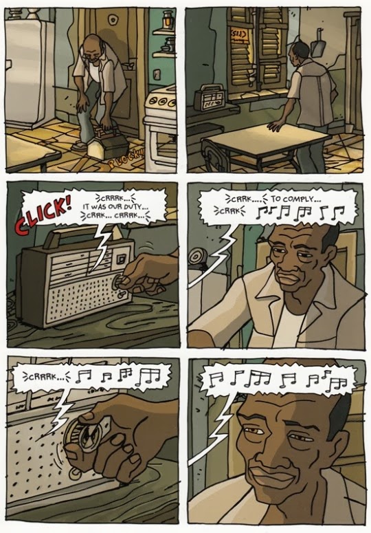
The Voronov Plot is an absorbing cold war thriller, that gives James Bond a run for it’s money. The plot stays on the right side of credible (unlike The Gondwana Shrine), and is, with the benefit of hindsight, is a little more gracious to the Soviet Union than many novels and comics produced during the cold war.

The book also features interviews, not only with the artist and writer, but also the colourist, which give a valuable insight into the creative process. They talk about their Hergé tributes (if you do not spot them they are revealed in the interview section at the end), and the colourist talks about the challenges of colouring a work like this, and how the eye of the reader has changed since the first books came out, over 60 years ago.

This is one of the best of the new Blake and Mortimer books that I have read, and if I was to compare it to one of the Tintin books it would be The Calculas Affair, one of Hergé’s best.


There are also figurines available, such as this one of Olrik, in his Russian uniform, costing 850 euros.

'Nocturnal conspiracies (Nineteen dreams, from December 1979 to September 1994)' by David B


David B has been recording his dreams for 35 years, and this book illustrates 19 of these dream-narratives. The subconscious is an important part of David B's life, and dreams have also made their way into his most famous book, 'Epileptic'.

This book is neither a story nor a conventional narrative, but a collection of dreams that he has recorded - some as a teenager and some later in life - and put into cartoon form. The artwork is influenced by the Surrealists - you can see Giorgio de ChiricoMax Ernst, as well as BoschGiacometti's cat also makes an appearance. All the dreams are set at night - lit by moonlight - with strong shadows and dark colours.

The act of making a book like this is in itself daring, throwing himself open to all manner of dream diviners, psycho-analysts and Freudian interpretations. There is a refreshing honesty and innocence in putting something into the public arena that is intimately auto-biographical, but (I hope at any rate) not pre-meditated or manipulated in any way. Our dreams are our own private property, and in them we see our worst, or hidden, selves, that do not surface once we awaken. David B has pulled images and narratives from this murky world, that most of us do not even remember when we wake, into the light.

There are recurring motifs - armoured trains, soldiers, the Resistance, shooting, gangsters, terrorists, sex, water, death, strange animals and the gaps between railway sleepers, and on a lighter note, (there are not many) books - I love the idea that he goes to a shop and finds books byRoland Topor (a French surrealist illustrator and author) that he does not know about - it would be a dream of mine to discover new books byHergé, or maybe an undiscovered Bob Dylan album, recorded in-between Highway 61 Revisited and Blonde on Blonde.

It is not only impressive that David B managed to record all these dreams, but that he had so many vivid and strange ones -  the sign of a very creative mind, that keeps working when asleep, or maybe a sign of complexes, guilt and feelings of inadequacy. Welcome to the human race!

The last cartoon is like a parable - a cowboy goes into a police station inside a hanger, full of cubicles - he tells each one "I would like to help you to do justice" - each time he is rebuffed: "too dated!", "too vulgar!", "too brutal!" - yet he does not get discouraged, he asks his question eternally.

David B, b 1959, has been working in comics for almost 30 years, and is an important artist of the French underground scene. He is not dissimilar to Marjane Satrapi (Persepolis), or Seth (It's a good life if you don't weaken) in that he is limited in technical skill, yet makes the most of his limitations, to tell complex, original and engaging stories. The book was first published in France in 2005, and translated into English in 2008. It is printed in spot colours (blue, brown and black) on uncoated paper. You can find it on Amazon here.


'Sloth' by Gilbert Hernandez.


Miguel Serra lives in a small American town, where nothing ever happens. Other teenagers end up committing suicide, or in jail, but Miguel, one day falls into a coma, and then, after a year, wakes up again.

Miguel is a changed person now. He can't run without pain, he is better in bed as he is slower and takes more time, and he stops playing fast music with his band, preferring a 'slow, sensual, rhythmic flow'. His band is called Sloth, but people now use this term to mock him.

Miguel's girlfriend, Lita, is in the band, with another member, Romeo. The three friends decide to go to the local Lemon Groves, to investigate an urban legend of the 'Goatman' - a creature that, if it catches you, will try to swap places with you. That's about as much as I want to give away about the plot. There is plenty of action, but as usual, with the Hernandez Brothers, the story is in the complex characters, their relationships, dialogue and thoughts. Gilbert Hernandez grew up wanting to illustrate superheroes, but his work transcends this genre. The dialogue is believable, and genuinely funny. The characters are inconsistent and fallible, in the way real people are, and actions always have real consequences, unlike the superhero genre.

I also love the idea behind the book - that someone could will themself into a coma, through boredom, and then will themself out of the coma again, when they feel ready to face the world. Despite the realism of his work, it is interesting that a completely impossible event is at the heart of this story. As the doctors tell Miguel, this has never been known before in medical history (a nice way to shoehorn a superpower into such a realistic book!). The event provides a springboard for interesting possibilities  - how would it change you, would you be aware that you were in a coma, what kind of person would do this, how would people react to you? There is also, in the storytelling, a blurring of the lines between dreams and reality, and the reader is not always sure what they are seeing.

The Hernandez Brothers' series 'Love and Rockets' mostly takes place in a small, Mexican village, without consumerism or even telephones. This, and the small town in 'Sloth' seem to create a blank canvas for anything to happen on - crime, bandits, bogeymen and madness.

The Hernandez Brothers are all skillful draftsmen, and seem to be able to depict convincing characters at ease. The figures are beautifully drawn, the settings well researched - yet the drawing is often invisible as you are swept away by the story, which is the way it should be with good cartooning. It is not a space for an artists to 'exhibit' their work - the artwork takes a backseat, like the cameraman in movies, whilst the story is on the front seat, driving the book along.

I have often seen books by the Hernandez Brothers in book shops and libraries, but did not pick them up as they all seemed to be about large breasted women and violence, which is not my usual choice of comic book. However, after reading Alan Moore's comments about them and the worlds they create, in his book 'Writing for Comics', I thought it was worth a try. In my opinion they are up there with Alan Moore in the originality of writing, the complexity of ideas and scope of the books, the strength of the characters and the quality of the dialogue.

Sloth was published in 2006 by DC Comics.


'Gemma Bovery' by Posy Simmonds


This book pulls no punches. With mature themes, complex plots and impressive cross-hatching, author Posy Simmonds depicts a world in which life and morality are as tangled and confusing as the Poincaré conjecture.

The first words tell us 'Gemma has been in the ground for three weeks now' so I am giving little away by telling you the protagonist dies, the rest of the book working its way toward this event through flashbacks and diary entries.

Gemma is the pretty, creative (she is an illustrator) second wife of Charlie Bovery, who, bored with London, buys an old house in rural Normandy. Posy Simmonds, a great observer of others, here seems to be drawing upon personal experience  - she married an older divorcee, with children from the previous marriage. She also spent time in France, finishing her schooling at the Sorbonne.

At the same time there are other attributes in Gemma that might not be biographical - the adultery and boredom for example - Posy being happily married for about 40 years. However, many of her characters are more satirical portraits, drawn with a degree of scorn. They are from the literary classes - writers and columnists from broadsheet newspapers - like those that Posy Simmonds contributed to.

The ex-wife of Charlie is a wonderful portrayal of a divorced woman, hounding and nagging her ex-husband, who, in turn is an utterly convincing character, avoiding conflict by refusing to discuss anything at all - in fact sweeping all problems under the carpet, including finances, particularly tax, which eventually catches up with him.

The crux of the story is the similarity between Gemma Bovery andMadame BoveryFlaubert's adulterous and bored character, and the neighbour, Raymond Joubert, who is fascinated by it. I find the literary references refreshing, in a genre largely developed for children - although this should not be a surprise for an author who for many years wrote for the Guardian (in fact Gemma Bovery was originally serialized there).

There is certainly something 'Hogarthian' about Posy's work. Hogarthis often thought of being the father of sequential art, yet his subject matter and satirical treatment seem to mirror Posy's work, and this work is, in some ways, a morality tale. Posy does not flinch from showing the pain that adultery and betrayal inflict, and in her works, people who do bad things (sometimes) get their comeuppance. This book also reminds me of Georgian literature, such as Jane Austin and Oliver Goldsmith, with their pastoral landscapes, yet her work is more post-modern, with few simple answers and morals offered to the reader.

This archaic style is continued in the illustrative style - reminiscent ofEdward Ardizzone, with his cross-hatching, or even Ernest Shepardand John Tenniel. Her work is in the tradition of classic book illustration rather than cartooning, giving it a sense of the past which brings something extra to the traditional world she portrays. Posy is a consummate illustrator, who effortlessly moves from loose lines, to a tighter style, and then to a classy cross-hatching, and line and wash. She has paid her dues, particularly whilst working for newspapers, with their demanding deadlines and has learnt to think on her feet, making up the story as she goes along, adapting and changing the storyline and details on the hoof. Her style is certainly not classic comic book, but a combination of written prose, illustration, and sequential captions - slightly daunting for readers of strictly ordered comic books like those of Herge, but something you very quickly get used to.

The faces of her characters are particularly expressive, and she often works in front of a mirror, making faces until she find the appropriate one, and drawing it. She is also a real stickler for detail, agonizing over small details, such as the breed of cows in the field, in another of her books, 'Tamara Drewe'.

The one aspect of the book I found unconvincing was the ending, when a new neighbour arrives, called Jane Eyre. This seemed a weak joke to finish on - almost like the punchline of a comic sketch - and it felt unnecessary, given the quality of what preceded it.

big screen version should be hitting cinemas in 2014, with Gemma Arterton (who starred in Stephen Frear's version of Tamara Drewe) playing her namesake, Gemma Bovery. It looks like it will be an Anglo-French affair, which should make it an interesting adaptation.


'Chico and Rita' by Javier Mariscal & Fernando Trueba


Chico and Rita is a love story about two musicians from Havana, who move to New York to try to make it big, recounting their experiences there and beyond, in Hollywood and Paris. Yet the real romance is the lovingly portrayed Jazz era, with its Art Deco setting, 1950s cars and famous musicians.

The piano playing Chico and singer Rita, meet in Havana, and while they admire each others music, there is an immediate passionate connection between them. Their on and off romance is as tragic as it is stormy, and the musical love story plays out against the decaying colonial grandeur of Havana and the bustling streets of New York.

Evocative atmospheres are conjured up, with the hot sun in Cuba, the morning rays of a wintery New York, dark, smokey night clubs and sultry summer nights, or the warm glow of a match on Chico's face as he lights a cigarette, and the old cars, trams and motorbikes, as full of character as the characters themselves.

The story is moving and captivating, and seems to come from a real love and passion for this time and music. Originally an animated film, this story has gone the opposite way to many comic books that are made into films. The film trumps the book in one major way - the musical soundtrack, which is so integral to the story, is missing. Yet the 2D nature of the drawing style means visually it translates well onto the pages of a comic book, and the energetic line looks like Herge after several Tequilas.

My main criticism is that the final application is slightly crude - the line and colour looks very digital, as if it has been done with a basic photoshop brush, rather than the subtlety that Belleville Rendevouzemploys and it would have been better to disguise it with filters and effects. That said, the actual colouring is beautiful, and manages to be both bright and delicate at the same time.

Chico and Rita works well as a book and its adaptation from film seems natural and effortless.

Javier Mariscal is a celebrated Spanish designer, animator and illustrator, characterised by his strong colours and energetic lines, and who turns his hand to logos, books, advertising and films. Fernando Trueba started out as a film critic and book editor, and is now a screen writer, director and producer.


'The Alchemist' by Daniel Sampere and Derek Ruiz

In 1987 a crime was committed in Argentina, the consequences rocking, first France before engulfing the rest of the west. The weapon was best seller The Alchemist, the guilty party, Paulo Coelho, the crime, the deliberate perversion of ancient wisdom and scripture to serve a philosophy of self-servitude.

As if this was not enough, all of creation and every ancient myth and tradition are held to ransom, at the sharp end of Paulo’s pen, and are made to grovel before his vapid ideology. Religion, superstition, occult knowledge and the universe are all cast down at its feet, to acknowledge Mr Coelho as the guru, the rabbi, the teacher and messiah, of our epoch.

His doctrine is that each of us has a ‘personal legend’, which the whole of nature conspires to bring to fruition, if we can only listen to our heart and follow the omens. Self-gratification is thus ennobled, and, a pathway that much of humanity is already on, is dignified. This philosophy is perfect for western civilisation, where self is God.

Mankind does not learn from its mistakes, and in 2010 another crime was committed, this time by comic book artist Daniel Sampere and writer Derek Ruiz. The Alchemist is now available in graphic novel form.

Daniel Sampere does a good job in illustrating the story – well researched, the illustrations are slick, confident and detailed. He is an excellent draftsman, in the mainstream comic book style, and, accompanied with its beautiful colouring, the artwork will satisfy many comic book readers. The adaptation is also good, although it feels at times as if the production was slightly rushed. I do not feel the storyboarding is very accomplished, and as series of images, I have seen much better.

Mainstream comic book style and ‘spirituality’ are strange bedfellows. Two goddesses are portrayed as large breasted beauties, with lush curly hair, cascading down their naked shoulders, and the men are all rippling torsos. However, the more I think about it, if our personal desires are elevated to the spiritual realm, why not include every desire we have. However, if I was commissioning an artist to tackle a spiritual book, I would find someone with a more lyrical style. Apparently Moebius was commissioned to do some pages initially, but Paulo Coelho was not convinced. This is a shame, as I think his book would have been both beautiful and interesting.

In his foreword, artist Daniel Sampere writes that his personal legend was to become a comic book artist. As much as I applaud this ambition, I cannot think of this as spiritual in any way, and if The Alchemist encourages us to elevate our desires and ambitions to this realm, then it has done an enormous disservice to mankind.

I also found the production and typography of the book careless. Some speech bubbles are sitting on top of characters’ heads, and captions seem to be placed randomly at times. Also some image borders are too close to the edge of the page, and are crooked. I also found it odd that images bled off the page, but were done in a rigid grid format. I would have liked to see, either a white border, or a more fluid graphic style employed (like Arkham Asylum for example).

The review on Amazon says that this book “continues to change the lives of its readers forever”. The Alchemist is loved by people who already have this philosophy, and are glad to find literature that justifies this selfish and materialistic way of life.

'The Undertaking of Lily Chen' by Danica Novgorodoff


The Undertaking of Lily Chen starts with an except from the Economist, about a Chinese practice of performing ‘ghost weddings’ for someone who had died single, so they would not spend eternity alone, leading to a spate of body snatching and even murder.

The story starts with a fight – we know nothing about the two young men or what they are fighting over – ending tragically, with one of them pushed into the path of an oncoming car, and killed instantly. As the other runs home, shown in wordless panels, the right hand pages tell in words alone, the 2000 year old story of warlord Caocao, whose young son died before marrying, and as he cries ‘Bring me the body of a woman’, the young man’s mother is shown, as she makes the same request of her youngest son.

The plot is the younger brother’s search for a ‘bride’ for his brother, and the girl he meets, who is fleeing from a marriage she is being forced into for economic reasons.

Artist Danica Novgorodoff’s beautiful watercolours often look like Chinese painting – abstract and painterly, pigment floated onto water, bleeding and running in the grain of the paper, calligraphic brushstokes and earthy colours. The characters are charming and engaging, and I found myself entwined in the story, fearing that Danica would not flinch from a tragic ending, always hoping the protagonists would find happiness.

Her colour palette is limited yet rich, her line energetic and expressive. She has a personal style that is hers alone, and does not ape anything I have seen. Her characters may not be consistently drawn, or proportioned, but this does nothing to diminish the power of the tale, and is more expression and style than lack of technical skill.

The dialogue is confident, naturalistic and economic. Danica moves the story along with seemingly incidental dialogue, but all along we are being pulled into the emotional web she has woven. Lily, innocent and full of vitality, wins the readers’ heart, and Dashiel, taciturn and burdened with the events that have befallen, is just as engaging and believable.

The book is dedicated to Danica’s grandparents, and two of the characters are named after them, Eugene and Ellen. Maybe Danica has Chinese blood, as she certainly has an emotional connection with the landscape and people portrayed.

Author Danica Novgorodoff calls herself an artist rather than a comic book writer, yet, despite such stunning artwork, maybe her greatest talent is as a story teller, eloquently sucking us into her world with a few flicks of her brush.


'Die Sonne – 63 Holzschnitte' by Frans Masereel


In a second hand book shop in Eton High Street I found a 1927 edition of Frans Masereel’s third woodcut novel, ‘Die Sonne’.

Originally published in 1919, Masereel creates a silent narrative in black and white woodcuts, each 80 x 99mm and packed with detail. Die Sonne starts with an artist falling asleep at his window, with a blazing sun in the sky. As he lies with his head on the table, a little man emerges from the sleeping man, and tries to jump towards the sun, arms outstretched. He tumbles to the ground, and is surrounded by a crowd of people: he points to the sun, and the crowd lift their hands in shock, or laugh at him. As he rushes up a staircase, towards the light the crowd follow him, shaking umbrellas and fists, horrified expressions on their faces.

The crowds are unable to suppress the little man, and despite throwing him in jail, distracting him with sex, alcohol, knowledge and religion, he continues, like a flower climbing towards the sun.

Almost every panel contains the sun, and even panels illustrating the ‘distractions’, a light reoccurs as a motif, emanating from a book, Christ’s halo and the candles in the church, the lamp burning outside the brothel, the fireplace and a lighthouse.

Masereel was a staunch socialist, and before his woodcut novels, he worked on socialist magazines, contributing satirical woodcuts to illustrate left wing articles. During the first world war he refused to fight, and worked as an interpreter for ambulance crews. Masereel was born in Flanders, and aesthetically his work is close to the German expressionists (George Grotz was a close friend), but his work differs from much expressionism, as the message was more political, and his medium reflects his desire to reach the masses, using mass media, rejecting the narrow confines of the art gallery and bourgeois connotations of canvas painting.

His work is more closely related to the cartoon, and with an 80 x 99mm space for his work, his characters, drawn with a few cuts of his tools, are caricatures, by necessity of the medium. The crowds are full of portly businessmen in top hats and umbrellas, the people gesticulate like actors conveying private emotions to a large audience, or a singer performing.

When Masereel was creating ‘Die Sonne’ cartoons were already quite sophisticated, and in America George Herriman was already writing his Krazy Kat strip. Dialogue was already integrated into comics, and literacy, even among working classes, was relatively high in Europe. So, why did he choose to make wordless narratives?

The silent film was at its height at this time, with their simple narratives and exaggerated gestures, Masereel’s work echoes this medium. The stark black and white of his woodcuts also is reminiscent of the strong lighting in ‘The Cabinet of Dr Caligari’ (1920), and other German expressionist films.

Masereel had a training as a painter and graphic artist, and these media influenced his work strongly, each image standing on its own as a work of art. Hergé took up to 64 pages to tell his stories, each page with up to 16 panels. Masereel took 63 images to tell the story of Die Sonne, using only two or three panels per scene. Each panel works like a painting, with many different elements contained, and, as with other contemporary painters, he did not feel the need for the written word.

The lack of words keeps the meaning of the text vague, and the interpretation of the story is left to the read. What is the sun? Is it God, love, justice, inspiration or freedom? Many socialist artists have been overly didactic in their work, but Masereel’s work remains relevant and alive today, as the reader can apply their own meaning to the narrative.

Masereel has been an enormous influence on a whole generation of comic book authors and artists. Art Spielgelmann cited him as a major influence, as did Will Eisner.

The book is small in size, just a little larger than A6, printed on soft paper with a yellow tinge (although this may be due to its age). The images are printed with a strong, opaque black, and leave a satisfying imprint, visible on the reverse of the page.

The works were printed in large quantities, up to 100,000 of each, so many copies should still be in circulation. There are also many new editions available, so you should be able to find copies of all of his works.


'Corto Maltese: The Ballad of the Salt Sea' by Hugo Pratt


This English edition of the first of Hugo Pratt’s stories about his most famous character, was released 45 years after the original. Loved by Italians and French alike, Corto Maltese has been translated into 15 languages, yet there seem few English editions among them, making this book a most welcome publication.

The story is set in the Pacific, amid factual events from the First World War. Some of the characters are loosely based on historical figures, for example the companion/nemesis of Corto: Rasputin, a ruthless pirate, with whom Corto Maltese shares a strange kind of mutual dependency and begrudging admiration.

Hugo Pratt brings a psychological complexity to a genre, started by RL Stevenson, and developed by Hergé, that often relied on clichés, yet Pratt not only places his stories into real places and times, but his characters are fully rounded as human beings, full of contradictions and surprises, but never less than convincing.

Hugo Pratt combines swashbuckling adventure with meticulous research, into details such as the Polynesian outrigger or the Fijian catamaran or the uniforms of the naval officers. Yet, at the same time, his work is sparse and minimalistic, using a few strokes of a brush or pen to describe a cloud, the sea or a building. His lines and strokes are lively and expressionistic, and it is as much about what he leaves out, as what he puts in.

The publishers have made an admirable effort at colouring Hugo Pratt's black and white cartoons. The colouring has been done by Patritzia Zanotti, the partner of Hugo Pratt, and they imitate his wonderful watercolours: scant, energetic and painterly. However, I do wonder if it would have been better to leave it as close to the original as possible. The artwork was done as black and white, and not intended to be coloured, so, despite an excellent attempt, the colourisation is not so successful.

The artwork has also been changed to fit into a smaller format, with fewer panels on each page, and this interferes with the rhythm of the story. No one would dream of doing this to a painting, so why change this masterpiece of comic art. In terms of the production of the book, I found the attention to detail lacking at times, with some schoolboy production errors, and I wonder if this is down to squeezing of budgets and time spent proof reading.

Despite these irritating mistakes, this book will grace any comic fans shelf, and the wonderful story telling, characters, drama and artwork, continue to shine through.


'Boxers and Saints' by Gene Luen Yang.


Religious people, particularly Catholics, have never distinguished themselves by an ability to see both sides of a story. However, in Boxers and Saints, Catholic Gene Luen Yang proves he is an exception, unravelling the events of the 1900 Boxer Rebellion in Beijing from two contrasting perspectives, in two books, sold together as a box set.

'Boxers' tells the story of Little Bao, leader of the rebellion, and 'Saints' the story of Vibiana, a Chinese Catholic girl, caught up in the struggle. Gene Luen Yang shows the same events through different eyes and perspectives, and through the windows of two opposing world views and philosophies.

Yang’s parents were from Hong Kong and Taiwan, and during his early years in America, reinforced their culture by telling him traditional Chinese stories, and you can sense his love and respect for traditional Chinese beliefs, with their gods, customs and rituals, and in 'Boxers' he is able to express this freely, without any Christian commentary.

Yang’s artwork is what I would call ‘Indie’ and sits alongside cartoonists such as Seth and Chris Ware. His drawing is not slick or technically accomplished, and is slightly stylised, using a muted palette of colours. This does not mean the images cannot be beautiful: the full colour plate on page 212 of 'Boxers' is wonderfully composed and expressive, beautifully conveying the blowing wind in the banner and long grass.

The books build to a conclusion where the two tales converge, and some kind of hope and salvation emerges from this bloody tale.

Yang brings both the traditional, Chinese, mythical spirit world together with visions of Christian saints and appearances of talking animals. Both characters are guided by beings from another dimension, as Yang points out similarities between the two cultures and faiths, as well as making for great story telling.

Yang shows that neither side can claim a monopoly on truth, bravery, sacrifice or justice.